Mallard is a bold, minimalist supplement brand identity created for a Gen Z wellness audience: visually sharp, digitally native, and designed to stand out in a crowded supplement market. The design system balances clean, health-focused clarity with a more expressive and memorable visual personality, making the brand feel both trustworthy and culturally current.
The identity avoids the overly clinical or generic look often seen in supplement packaging. Instead, it focuses on shelf impact, simplicity, and instant recognition. Confident typography, strong contrast, and a streamlined layout help Mallard feel fresh, premium, and easy to engage with across packaging, social media, and digital touch points.
Overall, the brand design positions Mallard as a contemporary supplement company for Gen Z consumers who care about wellness, aesthetics, and products that fit naturally into their lifestyle: smart, elevated, and built for everyday performance.
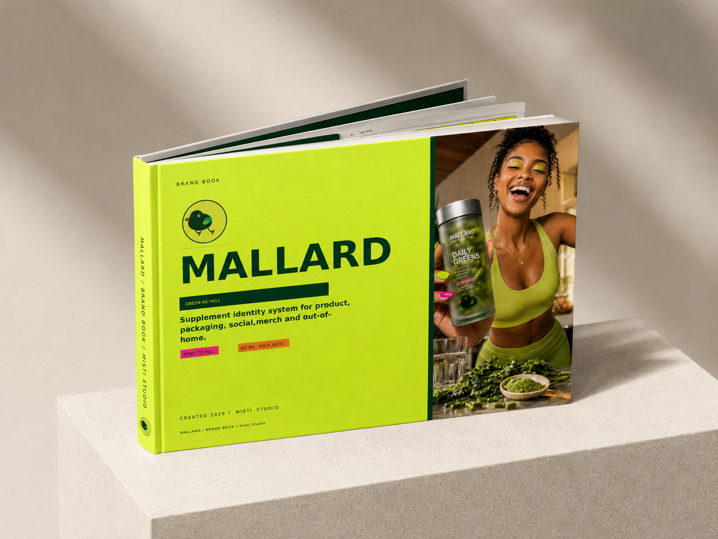
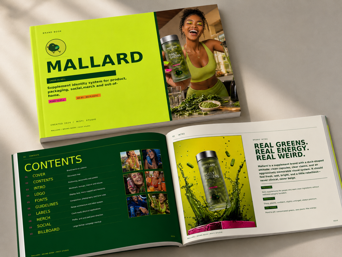
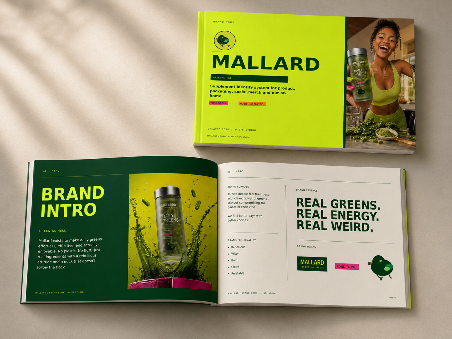
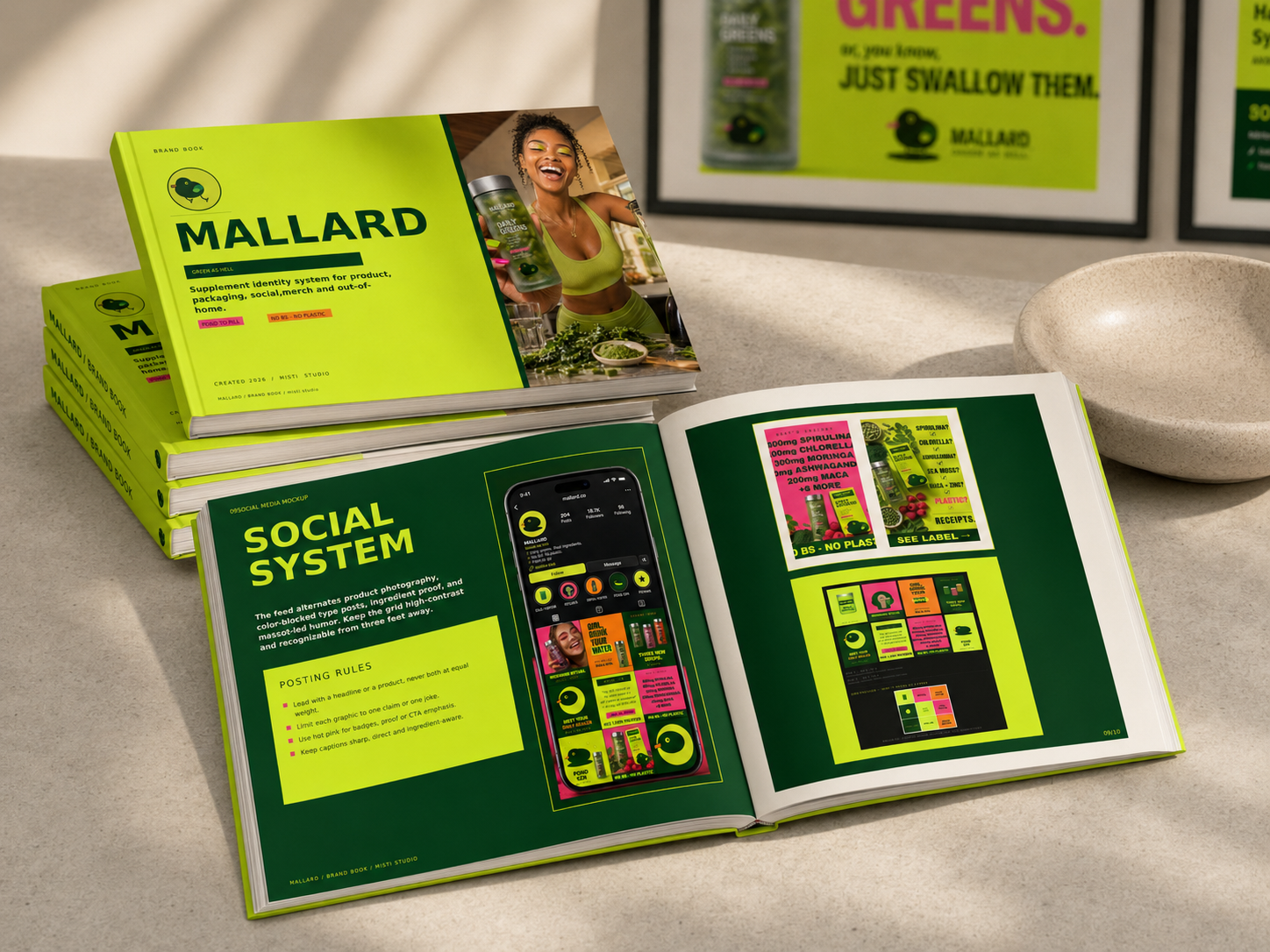
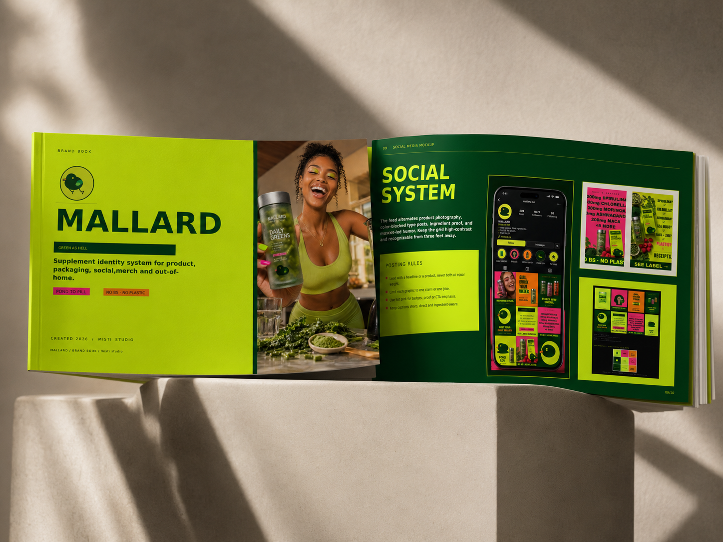
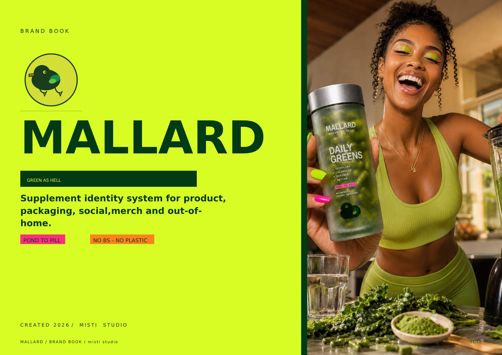
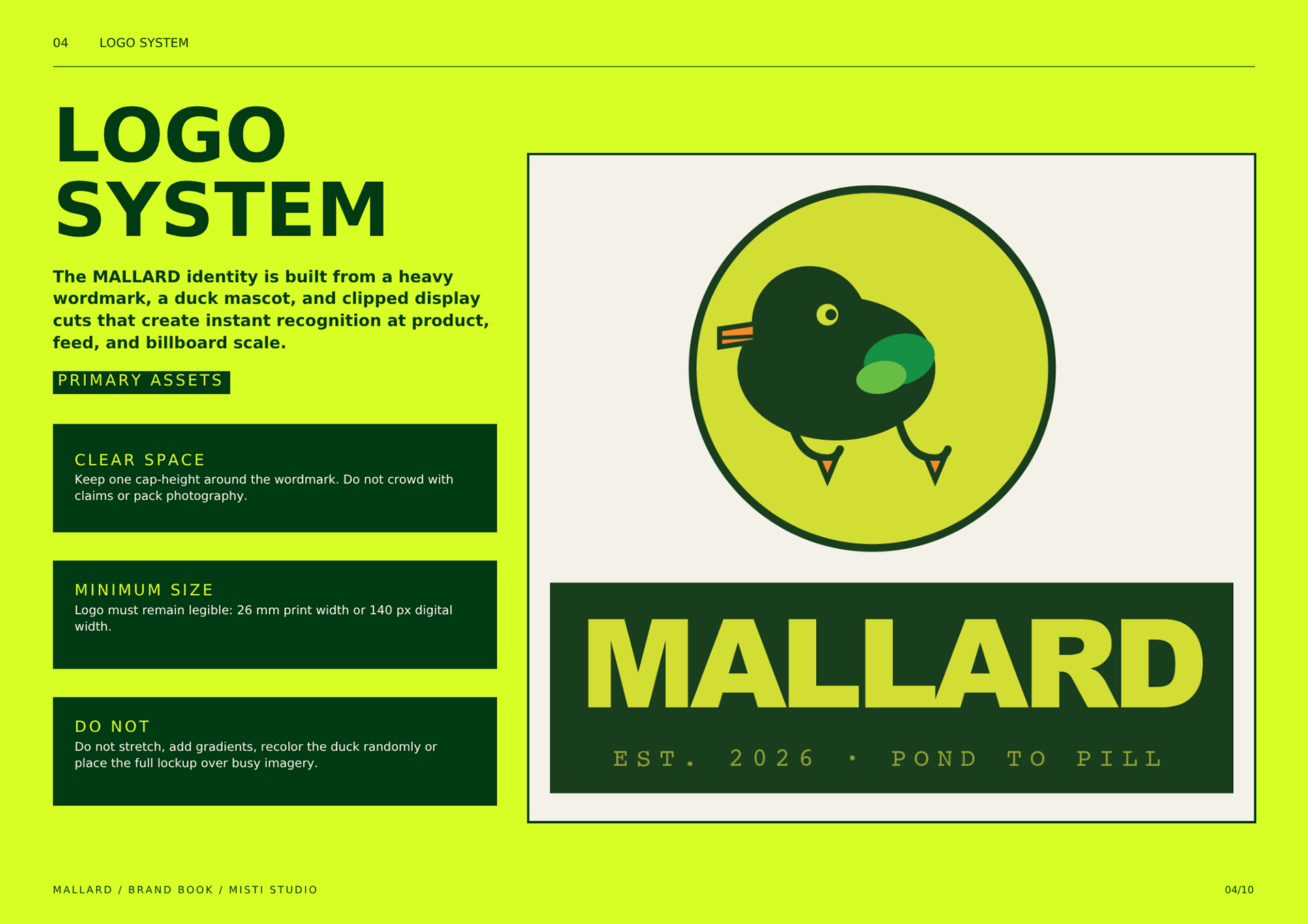
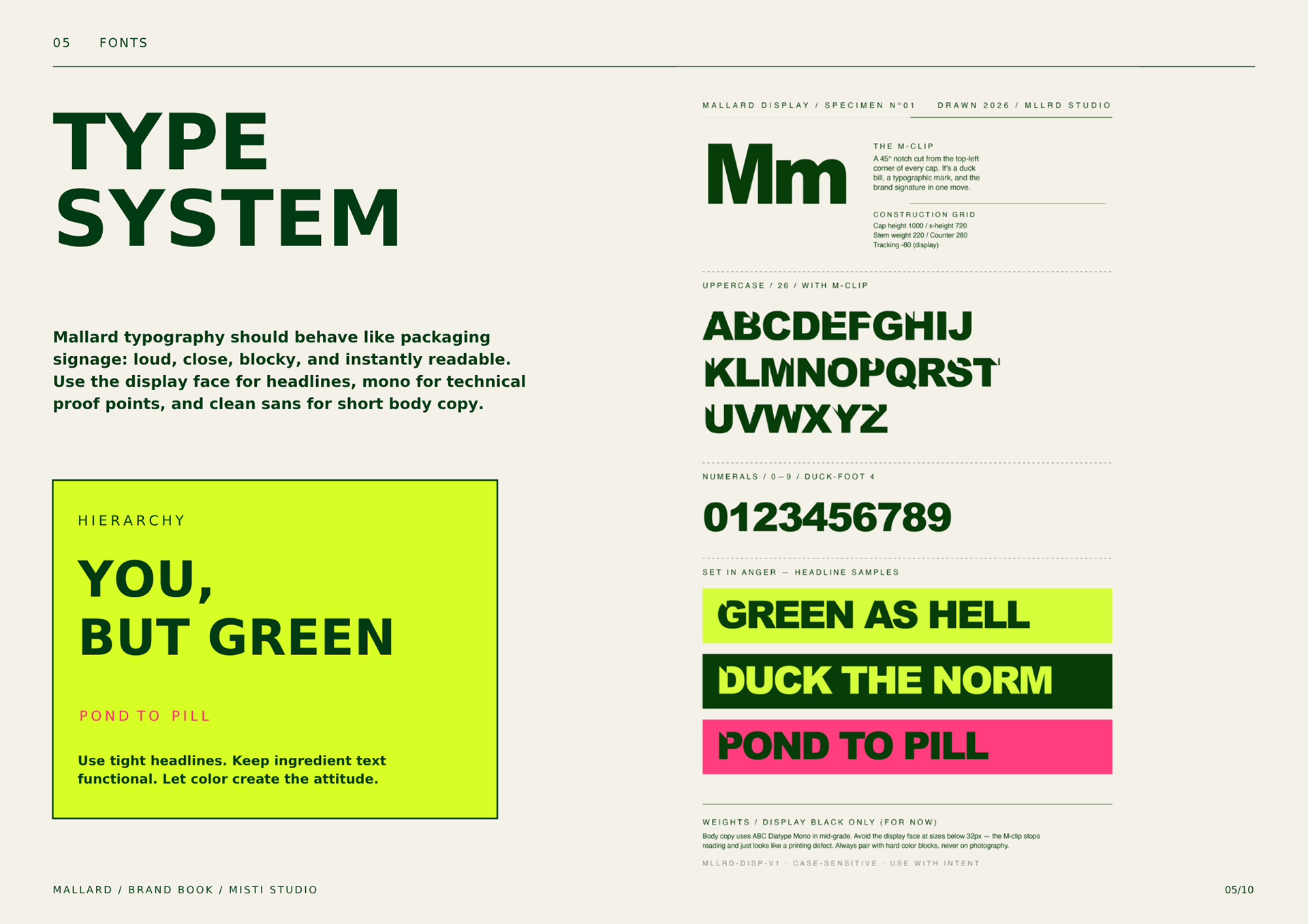
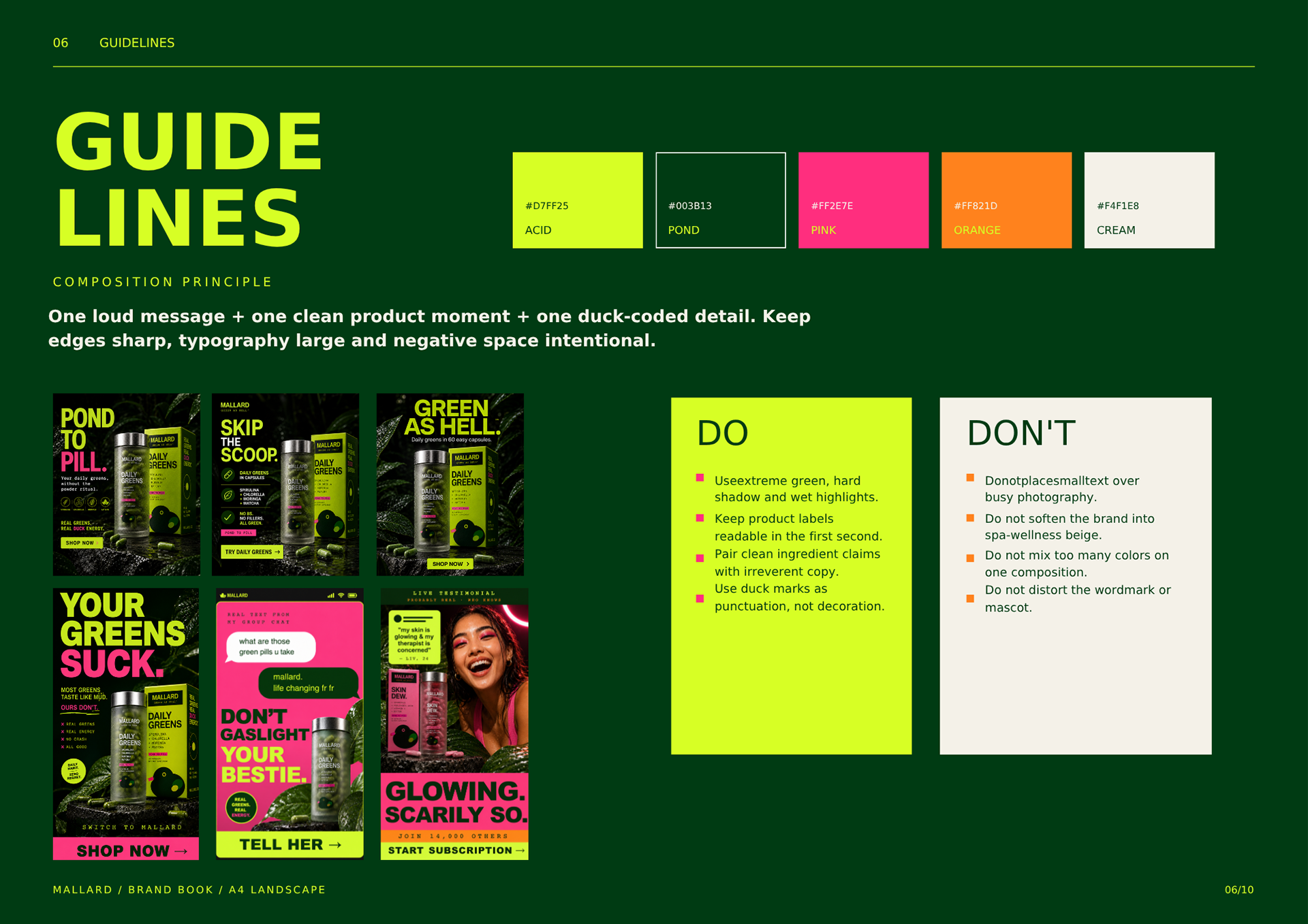
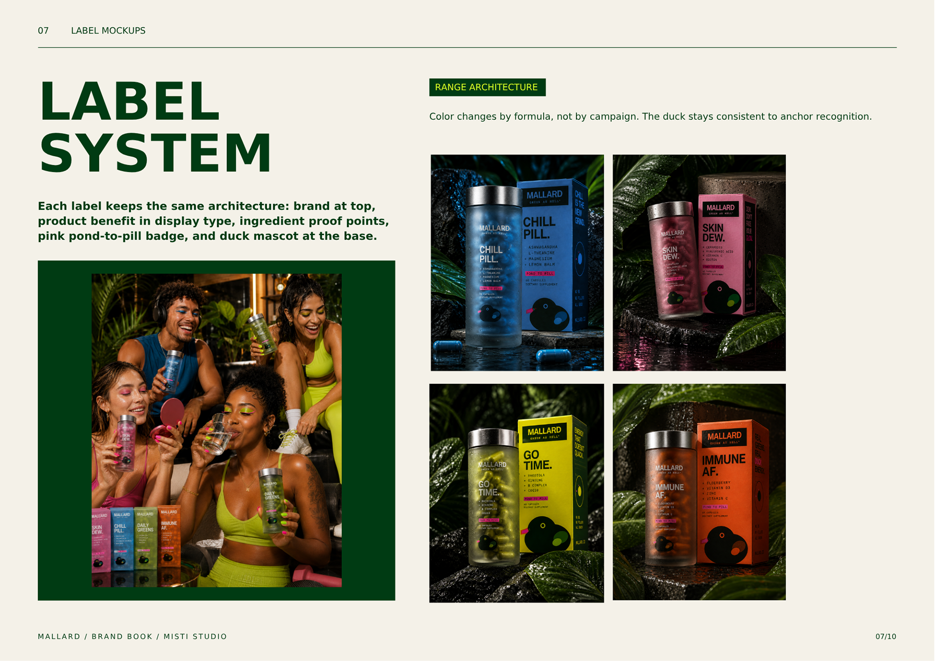
MALLARD identity built to make daily greens feel anything but clinical. The brand book defines a loud, high-contrast system across packaging, social, merch, and out-of-home, pairing acid green, deep pond tones, hot pink details, and a playful duck mascot with confident typography and punchy wellness messaging. It’s clean, rebellious, memorable, and designed to stand out in a crowded supplement aisle.
MALLARD identity built to make daily greens feel anything but clinical. The brand book defines a loud, high-contrast system across packaging, social, merch, and out-of-home, pairing acid green, deep pond tones, hot pink details, and a playful duck mascot with confident typography and punchy wellness messaging. It’s clean, rebellious, memorable, and designed to stand out in a crowded supplement aisle.